Archive for the ‘BLOG’ Category

You cant save a print with bobbly eyes.

April 26, 2010

There is not much I should say about my first collaboration with Chloe. She is a print sensation! – Like watching your Nan roast a chicken. I picked up many a practical trick – namely her excellent colour blending which I’ll try my hand at in a few weeks. But until we’ve both had time to get over the ordeal, we should not be allowed in the same studio space. I’m going to put it down to bad planning and deliriousness. The print is a may pole, surrounded by girls and ribbons and bells and fun. The first layer is an abstract may pole and was good, we decided. The final ‘cutsey’ layer was not. It was the downfall of the evening. We should have let it be after the first layer and deceased with the second. Perhaps we could not handle something abstract, which is not our usual style. That’s not to say we can’t do abstract, obscure and experimental. But we realize that you can’t rely on a cute kitten in a basket to save the day. You can’t save a print with bobbly eyes!

Souvenir print

March 22, 2010

sou·ve·nir

A token of remembrance; a memento.

I’ve learnt that people love prints as souvenirs – of a specific event; a festival, exhibition, club night, etc. I attend the END OF THE ROAD music festival of which Jack the Knife (screen print artists) run a stall at. They print souvenir posters for all the bands which perform. In some cases they also have the band sign the poster. Their prints are fantastic, but that aside, the print takes on a whole other meaning as it becomes a keep sake of the F*U*N time had by all at the event. So with every intention of Fancy and Fondant creating such souvenirs of specific events, we’re working with some event organizers to create our very own ‘souvenir print’.

In the mean time, I’ve created somewhat of a personal souvenir for Print 11. It’s a place I spend 5 days out of 7 – and a place that makes me feel very English – Bedford Square. (Squatters moved in this week.)

Bedford Square WC1B 3JA

This is not the first time I’ve used The Square – it was also the scene of my S.W.A.L.K. print

The idea of this week’s PRINT 11 was to create a souvenir of a place. I’ve sketched elements of the square, which I see and know, to create this ‘staged’ scene. I’d like to continue with this idea for other streets or postcodes in the area. There are several souvenir shops nearby Bedford Square, (not the usual establishments found on Oxford St.) which I could approach and ask if they’d be interested in displaying this print. My brother makes a very valid point that London souvenirs are incredibly desirable. This is a place on my doorstop that I should exploit.

Poster print – Rachel Richardson

February 28, 2010

This week I had the absolute privilege in printing a set of posters for Rachel Richardson (Millinery extraordinaire) and her upcoming exhibition stand at Paris fashion week. This was a rarity – in that it’s an absolute rare privilege – and also because I have never directly promoted ‘words’ in my prints before. The design was easy – purely based on the pictures that Rachel took of her fantastic creations. But the font / words threw me.  My pal Liz and I tried various styles as we zipped through an entire pad of tracing paper. But nothing was quite right. Rachel’s’ hats are extraordinary. She has laser cut wooden feathers, which adorn her hats. This is what then prompted my decision to cut out the templates from black paper, thus replicating her laser cut feathers. I arranged and glued each cut out template to tracing paper – 1 sheet of tracing paper for each color.

I realize that as a commission goes, I would not always be given the free reign to suggest paper cutting the words. I will at some point be asked to use a specific font. However in this instance the Client (Rachel) gave me free reign, thus putting my entire stamp on the overall poster. Rachel was stumped by which posters to use:

Lino cut

February 21, 2010

In an effort to expand my print skills, Chloe ( – Langlois, of ‘Fancy and Fondant’ fame) taught me my first lino cut. Quickly we realized that I did not have all the tools – namely a press. It was apparent that this was key after a failed attempt by use of a wooden rolling pin. After warming the lino, it was easy to carve into. (Note to self – remove the lino from the oven before it bubbles.) We loaded the lino with ink and then (eventually after sacking off the rolling pin) managed to print on paper by using the inked roller for pressure – thus creating more pressure (albeit more messy). The finished whale is incredibly primitive – almost a snapshot from a Inuit cave.

After purchasing a second roller, I experienced a more successful print: ‘Crystal ball’. I’ve looked at lino’s and see that the design is key – incredibly well planned comparitively to screen printing. Where I had not cut away enough lino in the whale print – I made up for in the crystal ball design. A smaller design = less concentration of surface area and a more sucessful print – by way of ‘home printing’ methods.

As Chloe has pointed out – I’m reworking my designs too much. More often than not the first sketch is the best. So lino cutting is this perfect exercise in which I cannot edit the sketch and prevail with the first sketch.

1 WEEK LATER – The very deep cut on my thumb has finally started to heal.

Not everything turns out how you’d expect

January 24, 2010

Already I notice that 1 print every week is no easy feat. I had the basic concept of a girl walking a killer whale.  Why or how, I know not. I wanted a ‘back to basics’ print – 2 colour and simple.  But it’s so easy to run away with. I considered using the computer for a start. A big no no. Don’t get me wrong, I can very much use Photoshop, but drawing is my niche. I hand draw the template and then hand print it – like I tell Chloe: drawing is our craft. I don’t get the point in hand printing a digital image – why not just take the disc to the printers, or indeed really embrace the digital age and email it. That way you’ll never have to speak to people ever again? Although I did only want 2 colours, I ended up producing a 4-colour print (each colour = 1 template). Where there is now blue, it should have been gold, (I never got to the studio until Friday and did not run an inventory of my paints – bad planning, sue me). The blue is a tad too Avatar for me – not sure my print will be the highest grossing, but I’m moderately pleased with how it turned out. I will return to this image and re-work with just 2 templates. The best ones are those that use no more than two. (Except Half woman / Half dresser, which is always an exception.) So like I say, things just don’t pan out, as you’d expect. But, none the less I am on a deadline and met it – Print 3.

A year in print – Sunday 10th January 2010

January 10, 2010

A year in print means that. In an effort to not lose face of my craft, I will produce a new print every week – 52 weeks = 52 prints. The first ‘screen print’ is as follows in it’s 1, 2, 3 stages of applying the 3 different layers:

(It was a snowy first week this year and all I could think of was something warm.)

David Newton Prints – Sunday 3rd January 2010

January 3, 2010

A YEAR IN PRINT

So this is where it begins. I have decided to commit to a years blog in which I document the trials and tribulations of pursuing a creative career – making a living from my art.

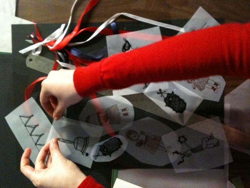
This began over a year ago in which I learned screen printing (- ‘screen printing’ is something I will elaborate on at some point in a future blog. For now it is a printing technique in which I can replicate my art through manual printing  – It is NOT computer / digital printing.) I love screen printing – it’s almost a technique in which you can experiment with your sketch book almost editing and coloring in preliminary sketches – not loosing face of an ‘original’ – every print is a one off. It’s a style which suited my work immensely and a technique which I wish I had stumbled across sooner.

I first learned screen printing at a studio called ‘SNAP’ in Bristol. An artist called Simon Tozer taught myself and my great friend  Vicky on a 1 day Christmas card printing workshop. I went back later that month and Simon helped me print a design I’d had for some time (a 5 colored print!). Having now been hooked I returned home to London, thinking I would return to Bristol to print again. I never did. My brother and his fiance then asked me to print their wedding invites, So I just joined a print studio in Dalston and prevailed with the techniques Simon gave me. The invites were a success and needless to say, I did not stop printing.

6 months later… I’d built up my ‘screen print’ portfolio with no particular commercial venture in mind. They were mainly prints that I was producing as specific gifts for friends. At the same time, a great friend; Chloe Langlois (- like me, she was also remembering her drawing hands after a lengthy spell away from it) had been building up her print based portfolio too. We decided to set up a market stall selling our prints (Fancy and Fondant). Initially our aim was to merely fund printmaking. We ran our first stall in October to great success and then booked a series of Christmas stalls from November through December 2009 at various art and craft markets in London. There was a real buzz in finding people that wanted to buy and appreciate our images.

The number of opportunities and ideas that were generated from limited exposure to other artists, arts professionals and members of the public surprised me. People were very generous to new faces, sharing their ideas and experiences. There is a wealth of knowledge ‘out there’.  This led me to want to document this journey not only through prints but also an online community. The kernel of my idea is this blog: an online forum where I can maintain a diary that follows the path, marketing ideas, strategies, contacts and crazy plans that succeed and fail across one calender year. This will be an open forum and will feature created visual images – working to produce an illustrated ‘How to’ guide for emerging creatives. It is going to be a huge challenge for me to swap my ‘creative’ head to a ‘commercial’ head and I think this is a challenge that any successful artist has to struggle with.

Chloe and David’s print market project is called ‘Fancy and Fondant’ (www.fancyandfondant.com). This project remains. Think of Fancy and Fondant as the ‘product’ and this blog (David Newton Prints) is the diary of me as a contributing artist to this joint venture and beyond as an individual.

I will structure this so that I don’t loose direction and by the end of the year can support myself through printing. One problem highlighted through the December market stalls is the time and energy put into selling the print was taken away from creating a new print. Consequently,  I intend to set a rigid structure, a manifesto that I will carry out for the year. The first line of my manifesto is that I will produce a new print every week:

These prints are going to be part of the story, they will be reflections of the journey I’m on and reactions to commercial opportunities – 52 weeks, 52 prints.